Showing posts with label Japanese. Show all posts

Friday, November 22, 2013

Ninjas Caught On Camera!

The last of the three clusters for my Ten Thunders crew arrives!

After this it's just the leaders: Yamaziko, Misaki, and Ototo.

Torakage are quite clearly meant to be ninjas. Upon research, I have uncovered some neat information about true ninja garb. First, the myth; ninja did not wear all black, necessarily. That is a notion coming from kabuki theatre which, as you may have seen on the internet, uses people dressed in black, against a black backdrop, to render them 'invisible'. Of course, you can still see them, it is just customary to ignore their presence.

Imagine then, the horror and surprise of the audience when one of these black-clad, utterly ignored characters draws a blade, steps forward, and kills one of the characters! Perfectly they've managed to convey the idea of the ninja.

Why is this important to understand? Imagine if, in the future, we move beyond lead-firing guns, to energy weapons. People at the time still like to play-pretend soldiers from our era, and in doing so, imagine all guns to be the bullet hoses seen on so many movies (lookin' at you, Rambo) and spoofed on others (Evil Dead series, arguably.) That's about how true historical ninja would view our treatment of them these days.

"Well then, Reid" I hear you saying, "what DID they wear?" Much like many secret agents of today, they wore whatever would fit in the best. Fine kimonos at a party, dirty peasant garb in the streets, loincloth in a bathhouse, etc.

Circling back to Malifaux and our Torakage, now; their clothing is quite similar to what peasant garb could be, but with perhaps a couple of odd extras. The skirt-device, scarf, and of course face mask being the most notable. With their rule stating they can lose themselves in a crowd, it's clear their garb is meant to be mundane. For my part, this meant clothing that was both drab, and almost entirely undecorated. It's much harder to identify someone when you're only told "That guy with brown pants" as opposed to "the one with the lotus kimono in black and white with jade accents".


So first, the consistent things: all have red belts, and red kneepads: these are the things identifying them as part of the Ten Thunders faction. Originally, their headscarves were painted thus, but it was far too large an area, and made it too dominant on the model. I may yet detail their scarves as they earn noteworthy kills or achieve objectives. Furthermore, their bases are likewise the most mundane: Cobble roads, sidewalks, etc. These are not the Oiran in their gentle settings, nor the Archers in a full mix; these are folks who slink through alleys and dodge the light of Malifaux's lamps.

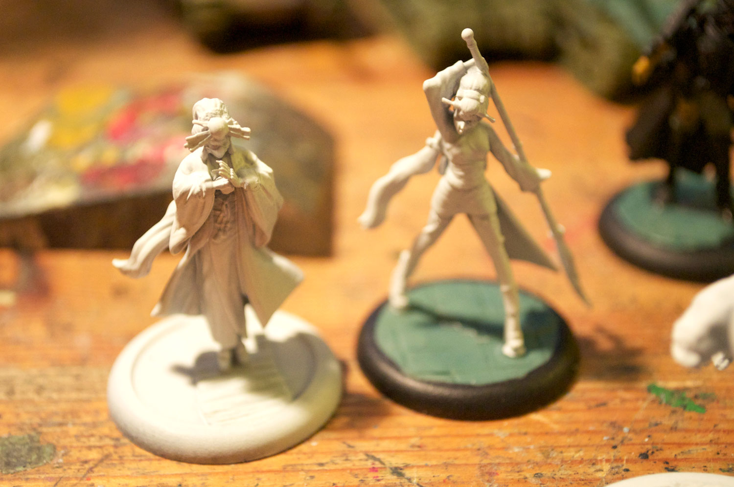
The masks of the Torakage are interesting. Despite the ninja feel of the rest, their masks are plain and flat, which is not a traditional Japanese style mask. The Japanese prefer carved masks that look like demons, or stylized forms of the warrior underneath. Luckily, the Chinese have a smooth mask tradition with beautiful painted details. I decided to attempt to emulate their patterns, and furthermore tried to keep black paint away from the eye slits, lest they be lost in the designs.

First up is the Torakage who gets the award for weapons most likely actually concealable. His outfit is a consistent blue, with green and brown on what I have to assume is their 'weapon smock'. For most of the colours on these, I started with colours inherently drab, and mixed up with a more grey tone than pure white, making them appear worn and dirty. He is also the only of the three to have decorated clothing, and even then it's a simple repeating three-dot scheme.

The Femme Fatale of the crew is channeling the schoolgirl from Kill Bill. Her mask was painted tiger-themed, and with my self-imposed rule of repeating colours throughout, shares the green border and blue on her smock of scythe above. Be warned when gluing her: I highly recommend getting a very thin pin drill, some modelling wire, and pinning her foot to the ground. It is a very thin join for a model this tall and thin!


The beefiest of the Torakage also has the least concealable (and perhaps least practical) weapons. This is, luckily, balanced by an absolutely awesome pose. As before, the brown and green on his smock is the same as the female Torakage, and the blue of his mask matches the blue of scythe's. Otherwise his outfit is very drab, and subtly painted.

Something else consistent across all three is the forearm covers. I figure their work up close with bladed or heavy weapons would probably end up with a couple hard-to-describe splatters on their forearms. The covers allows them to be quickly  shed to appear 'normal' if they get chased, and also, being white, can be  a mark of pride for the Torakage after a mission, and proof of their success. (It's also the only reason I can fathom this final Torakage has attached his blades to his arms: The weapon I think they're meant to imitate is one where flipping it around unconnected from the arm is how the weapon is used!)

With them finished, I must take a break from Malifaux for a bit to finish up a Panther force. I have been trying to make source-lighting work on Yamaziko's lantern, which may take a couple of passes before I'm entirely happy with it.

Wednesday, November 13, 2013

A Gentle Caress of Blades

My Oiran are finally finished! Let me tell you, these ladies took a while to finish off; in part because of the detail I wanted, in part because of the detail on the models.
Probably the least subtle of the hidden blades...
As with all my projects, the first stage was research. I spent a lot of time looking up traditional kimono colour patterns, what various designs would mean, and then just general information about kimonos, Geisha, and as I later realized, the distinct group; Oiran. Unlike Geishas who are primarily performers, the Oiran are courtesans. Having seeped myself in knowledge, and armed with my colour schemes, I set out to make each one distinct and beautiful on their own, with only a subtle nod to the Ten Thunders faction (the red on sandals and hair ties).

I love that she could be cracking her knuckles. Her metal-plated, blade-bedecked terrifying knuckles.
My first Oiran I decided I would make a subtle pink. I tend to enjoy strong bright colours, and so intentionally muting the tone was an interesting change for me. Since her outfit is the most classical "Oiran" look, I decided to make her the leader, or most experienced of the group, and decorated her kimono with Peonies. (No, not ponies...) A subtle pink exterior balanced by a stronger interior, repeated on her sash, belt, and tassels unified the look. To contrast the soft muted tones of her outer robe, I did a strong, deep blue underneath, shaded to look silken, but undecorated. Her hair, as with all of them, was done in gloss black to make it look very well kept, and subtly highlighted by mixing the black with a mid-tone cold grey.

As with the other two, one of the hardest things to paint on her was the makeup. I wanted to make it suble: Not clown-like, but still the pale face so famous of Japanese courtesans. This was achieved by starting out with the normal skin tone, but then highlighting it with pale sand, and later white, more strongly than I would otherwise. She is also on the koi pond base from last entry, suggesting that "if you want to cross, you go through me" feel.

(Btw; click on the pics to see them even bigger!)

Next up is "Koi". This kimono started out being airbrushed with a rich blue over the white kimono. I mixed the paint, and feathered the airbrush to make the gradient less a smooth tone shift, and more of a sea spray transition. After that was done, the white parts of the kimono were carefully touched up, and thin white glazes added shading to the sleeves so I didn't have to mix paint for each part of the gradient to highlight them.

The koi themselves were painted first, similar to how the pond ones were: Bright orange, overlaid with increasing mixes of pale sand. The belt was originally bright orange as well, but it distracted from the koi, and was replaced with a similar sea-colour teal.

Her legs were painted to make the stockings look translucent by gradually highlighting from a mix of black and skintone in hatched highlights. First, the 50/50 mix would be hatched top-right to lower-left, then the 60/40 mix atop it done top-left to lower-right. This, combined with the overall thinness of paint, gave a fine hatched look without (I hope) looking like fishnets. Also, on a whim, I painted fingernails on any model who had them exposed in a strong red, both to distinguish fingers, and to again tie back to the Ten Thunders.

Finally, using thinned white paint and my smallest brush, I traced wave-lines along the kimono, and added a few dots of darker brown as pebbles or whatnot. The masks on all three are metal, which I debated for a while but decided that, as courtesans going into battle, they'd care significantly about protecting their face!

The last of course, is "Cherry". How could I do a series of kimonos and not include a cherry blossom one?

She too started her life out with an airbrush layering of green over white, highlighted as above. Pink is a natural complimentary colour in kimono history, and so her sash, and conveniently the blossoms themselves received that treatment. The branches were made before the blossoms; thin tracings of black. Originally I thought about decorating her fans, but a combination of the way they're half-folded, and the lack of sharp edges on the plastic made me hesitant to try.

I was happy to discover that the shoes of Oiran are almost consistently a lacquered black, which freed me up from attempting to imitate a wood pattern like Geisha typically have. On this size, and with the plastic's limited detail, I tried them and utterly failed to make them look convincing. The lacquered black is more historically appropriate, and it nicely ties together all three models, as well as distinguishing them from the bases, which were kept drab and plain, though I am really tempted to add flowers on the base around Cherry...

Go on, I'm sure they're friendly!
So that's all three Oiran! They're my least-subtle of the Ten Thunders faction yet, but I figure unlike the Torakage, who must pretend to be normal citizens, or the Archers, who are just citizens, the Oiran are the most likely to be accepted walking into enemy territory unimpeded, and the brighter colours reinforces that. Also, a slight break from tradition: The things sticking out of their wigs are traditionally orange plastic, but I figured when they're called to action by Misaki, their decorative headpieces are themselves further weapons in their arsenal.

Another thing you may now be able to notice slightly with their colour schemes is they all nod to one another slightly. Cherry has pink like Peony, Peony has blue like Koi, and Koi's belt (and ankle guards?) are green-tinged like Cherry. I'm trying with all these to have a subtle colour unity throughout the sub-groups of my crew. Painting all three at one time makes this smoother: The paint I mix up to paint Peony's kimono and sash becomes the same colour used to dot Cherry's kimono and paint her sash, etc.

I will soon do a post on faces, since you may notice unlike many others, I've not attempted to paint detailed eyes on most of these. I've got my reasons, and they're ones I think others may benefit from. Depending on whether I get my Torakage photographed soon, I may do them next.

Friday, November 08, 2013

Koi Pond on a Base

The Oiran are now finished! I'll do a post for them as soon as I get their photos edited. In the meantime, here's a thing I did for the base of my Oiran "leader".

I decided I wanted to put her on a narrow bridge. Her pose looks like she's about to bow (martially) to an opponent. I figured putting her in a place where the enemy would have to push past her would reinforce this motif. I'd tried doing similar things before, and know that I am inspired by the incredible work done by [url=http://www.thisiscolossal.com/2012/01/riusuke-fukahori-paints-three-dimensional-goldfish-embedded-in-layers-of-resin/]Riusuke Fukahori[/url] though I have less room to do it, and am trying at a much smaller scale.

 These are my primary tools. The clear leveling gel makes decent water effects on flat surfaces, along with green and orange paint for the lilypads and koi respectively.

First, I painted where I wanted the fish to be, and put in some pads that hadn't surfaced. The orange at this point was slightly darkened with brown, to reinforce the 'depth'.

Next, a thin layer of the gel, adding a bit of height for the next few layers. The more successive thin layers you make, the more realistic the effect. For the scale, I ended up doing three, since the height difference wasn't enough to take more. If I ever re-make the base, I might cut through the base, giving me a couple more millimeters to work with. After this layer of gel, I put down a glaze of murky green-brown, to look like the pond's water wasn't crystal clear.

Next, a second layer of orange on the koi, attempting to look like scales was added. Further, some of the lily sections gained new pads, or had over-painted pads to look like the cluster building up.
After a thicker layer of gel, I did one final highlight and seal layer. If you want some of the lilypads to look surfaced, paint them after the final level of gel; they'll reflect the light differently and not appear to be wet with water.
Here, then, the final product. I'm mostly pleased with the result, though if I end up going back, I'll probably end up detailing the surface lilypads more. It does have a nice 3d quality, and it might be fun to do a second base without having her on it, just to see how it looks if that's the only part of the 'model' I'm worried about.

The rest of the Oiran will be in the next post, hopefully soon!

Thursday, October 31, 2013

Ten Thunders Archers

After some work, repainting, and careful attempts to fix up certain areas, I have finally finished up my archers! There are some areas that didn't work out quite how I'd hoped, but overall I'm pleased with the outcome. With that, time for pretty pictures!

How fast can you run?

I decided on a theme with the crew, since they have such disparate parts. The Torakage (not yet finished), being essentially ninjas, would have clothing that is as much as possible 'standard citizen' in colour and pattern. The Archers, being to my mind about the same level in the hierarchy, would also have mostly 'plainclothes'. Of course, I needed a way to distinctively mark them as Ten Thunders even still, and decided on using spots of red on each model, somewhere, to declare their allegiance.

The consistent sections for the archers are their 'helmet curtains', quiver, and bow string and tassel. A few have other elements, but those would be the consistent ones.

Early on I decided this model had to be on top of something. Finding a twig was as easy as walking outside, and after some careful cutting, drilling, and pinning, I had a stable perch for my archer. The advantage of this is it gives him more of a sense of motion too. He's not just crouching to sneak a shot off in an awkward pose that isn't just kneeling, but is instead mid-leap on to, and then presumably off of a broken tree.

Also here, you can somewhat see the tattoo pattern I applied to most of them. I'd looked at lots of photos of Yakuza-style tattoos, and attempted to emulate them, which in 32mm is not easy... All the colours I was going to apply got mixed with flesh tone to make it look like they're sub-dermal.

His clothing, as I suggested earlier, is a very mundane, drab, grey and brown. I've always found that the more fantastical settings feel more 'real' the more realistic all the individual elements are.

Here's my calm and collected archer. Sadly, he's managed to pick up some of my cat's long hairs already, but luckily post-painting, so they're not adhered. This one also features some more significant conversion than just adding bowstrings, in that I gave him little sandals of the traditional sort. I reinforced that formal feel by having him standing off a boardwalk of some kind. This guy's tattoo pattern is a dragon, with the fanged mouth right on the shoulder, and his kimono is meant to be patterned with a lotus-style flower. Sadly, I noticed the wash pooling in those front creases after I took the photos, and will be going back to fix them...

This archer was the first I nailed down how I wanted the colour scheme to go, while the rest were made more earth-tone to contrast him.

My final archer is the one that has given me the most trouble. The hair acting as his bowstring is under significant tension, and infuriatingly, has snapped a number of times. I've managed to glue it in place for the time being, but Lord only knows how long that will hold. This guy is also jumping over a log, to tie in with the other one, and sports a more traditionally black kimono, offset with brown pants and a dark green shirt. The small dotted pattern helps to make him seem less dreary, and the bright belt contrasts the red and overall drab. His tattoo is a series of flowers and leaves, and is the one that looks the most striking of them in person.

Since the photos, I added static grass in patches to the bases, using a dead-yellow short fuzz since I figure the grasses in Malifaux are all kinds of strange, and it helps them look all drab. Also something to note: when painting clothes, keep your highest highlight and darkest shadow relatively close on the spectrum to make the cloth look fairly rugged and 'typical'; cloths like cotton or wool won't vary much. If you want to make them look silken, strengthen your lights to dark, since silk reflects light so much more readily. If you look at the third archer, just above, you can see his black cloth and green shirt look to be made of far more durable fabric than, say, the red cloth that makes up their helmet curtains.

Next, I intend to finish up the Oiran. I have their masks, bases, and some details left to do before they get photographed as well!

Thursday, October 24, 2013

Ten Thunder Archer Helms (At Last)

I love the Ten Thunder Archers. Their garb almost perfectly matches traditional ceremonial Japanese archery, their poses are dynamic, and the level of detail is marvelous. I have, despite this, one problem with them. Their helmets are most frequently shown to be, I believe, painted metal. Even their art card has a weird blue-teal-grey colour which is certainly accented like it were metal.

Link from www.beastsofwar.com

The problem is; there's no way an archer who is entirely otherwise unarmoured has a massive metal headplate. It's not practical, in my opinion.

While it is similar to traditional Japanese cone-hats, it's not conical, and therefore, wouldn't be made by woven reeds, as would be the case traditionally. What then, is a somewhat obsessive model painter to do?

Well, I figured wood would be a good solution. It's lighter than metal for the same density, and cut properly, would provide all the protection an archer would need from an overhand blow to the skull. First job, as always, was seeking out inspiration. How could a devoted modeler ever figure out the exact variegation and pattern of wood cut to a flattened-domed shape? I just so happened to luck out in the form of serving bowls we have here at the house.
Almost like it was meant to be for this!
After a bit of study, observing how the angles came together, I base-coated the helmets with Steel Legion Drab (Citadel paints). This was followed with a mix of it and Pale Sand (Vallejo 70837).

This was mostly just to get the shapes in, but using a thinned-down coat and lightly feathering the paint on to the helm made it pretty close to what I wanted in the first run. Following the bowl, and the idea that wood is harder to chop through against the grain, you can see two of the three have helms cut that way. The third is different mostly for variety, but also it's more an angled cut than a straight through, hence the width of the grain. I took effort to make the rings connect from left to right side, and the closer it got to the top, the more variance I threw in to stop it being perfectly circular. This will really help the wood feel more natural, since real wood is rarely if ever consistently thick throughout the entire piece.

The effect was, however, a bit paler than I was hoping to achieve, so I followed this up, once it was dry, with a glaze/wash mix of Agrax Earthshade (is there anything it can't do?) and Vallejo Ochre Brown (70856).

I applied this relatively thickly, but made sure it didn't pool anywhere by pulling it back off using a dry brush if it did pool. The eye symbol on the front also received a wash of straight Agrax Earthshade just to really pull it out in detail.

After this had thoroughly dried, I re-highlighted with the 50/50 Steel Legion Drab and Pale Sand from before, focusing on the upper edges of the rings, and where it approached the top, I applied it in an almost hatching-pattern, applied over a section and quickly dabbed with my finger to mitigate how strong it looked.

The big advantage of this method of wood painting is that, due to a combination of physics and chemistry of paint, it does start to take on the effect of wood. Since real wood has more-opaque rings gapped by more-translucent, darker sections, cut into a curve you will see the 'darker' sections receding. Painting the darkest sections first, and having a glaze/wash halfway through, adds an incredibly subtle, almost-imperceptible 3d effect to the paint, which the eye reads in a similar way to wood. It also helps that the smooth, large area of helmet, and semi-matte finish of the paint allows it to shine like wood that's been well buffed, but not necessarily varnished.


Now I just have to finish their tattoos to a similar level of detail, finish the patterning of their clothes, and convincingly paint their bases, all without damaging what I've already done to their helms... If it works, you'll see the fruits of my labour next week!

Tuesday, January 08, 2013

Malifaux Thunder

I have become enraptured by the idea of Malifaux. The world is fascinating, and then when I saw The Thunder faction, I was absolutely sold. The models are beautifully sculpted, and fascinating.

The bases are all slottabases, but the models don't have slots. This makes it basically necessary to do fanciness, and so of course I wanted to do them up properly.

The more 'refined' a model, the more refined the base. The Desperate Mercenary (sadly out of focus) is on a mix of rough stone and old planking. The first of the Oiran is delicately stepping off a wooden level on to a piece of stone in the midst of either random dirt, small stones, or an ungroomed zen garden.

The other two Oiran, essentially Geisha, are on a set of Tatami mats (right) and the other central on a thin wooden bridge (as a kind of: "to pass, you must defeat me" notion)

The three Torakage (peasant-looking ninja) are on, respectively, stonework with Japanese kanji inscribed, and two others on a typical road or sewer style base. There's a distinct line of thin sidewalk, and some 'road'.

Finally, the two characters from the starter box. First is Ototo, a big Oni-like character. I disliked how far off the base he sits, so I I modified the plough shape, pushed his mace off the base a bit, and added some tiles pushed up and out by the force. Misaki herself is on a base that's distinctly a zen garden, made from my thumbprint. To help with the whorl caps, I put small pieces of gravel as stones, and the single foot touching the ground rests upon one of these, as though she too is delicately attempting to avoid touching 'base ground'.

I'm now researching colours and proper patterns, so I can paint them up as beautifully as I can. I intend to use proper colour patterns, and markings. I am frustrated in this search by so much misinformation about ninja, and such insane detail and variety in Kimono pattern. I'm going to make Yamaziko and Misaki Orange (royal colours in Japan), the Torakage faded blues and greys (typical peasant garb), and something for the Oiran that looks appropriately Geisha. Ototo himself... I'm not certain. Yellow for divine? Red for blood and aggression? I'll figure it out perhaps when I see the rest.