
We grabbed a bunch of miniatures from GHQ, with him taking the Japanese fleet, and I exploring the US fleet. I ordered a selection of destroyers and cruisers that would fit any engagement to start, but of course, being a magpie and rivet counter, that has since expanded to a wide selection including three battleships, three carriers, and a variety of cruisers, destroyers, PT boats, and subs!
Tackling bases was the interesting challenge I wanted to share with everyone today.
I wanted to ensure that I got the translucency effect of water on my bases, had ones that would allow me to grab and move the minis without grabbing the delicate 1:2400 ships, and look good in any photos. I was lucky some time back to pick up a product that offers acrylic paints with texture, and the two specific to this are an ultramarine blue and a pale teal (not photographed):


In Step 2 I airbrushed a cone of teal from the aft section of each ship, spreading out and hazing as it went, covering the areas with white painted before.
Step 3 saw the beginning of application of the Blue Deep. The first application was to add a bow wave, and the borders of the aft chop. This was in the darker blue. I used a medium thickness brush that had started to go, so I didn't mind if anything gunked up on it. The consistency is similar to liquid greenstuff, so a rolling shape allowed me to goop it on, and then tease it into shape later with a wet brush.
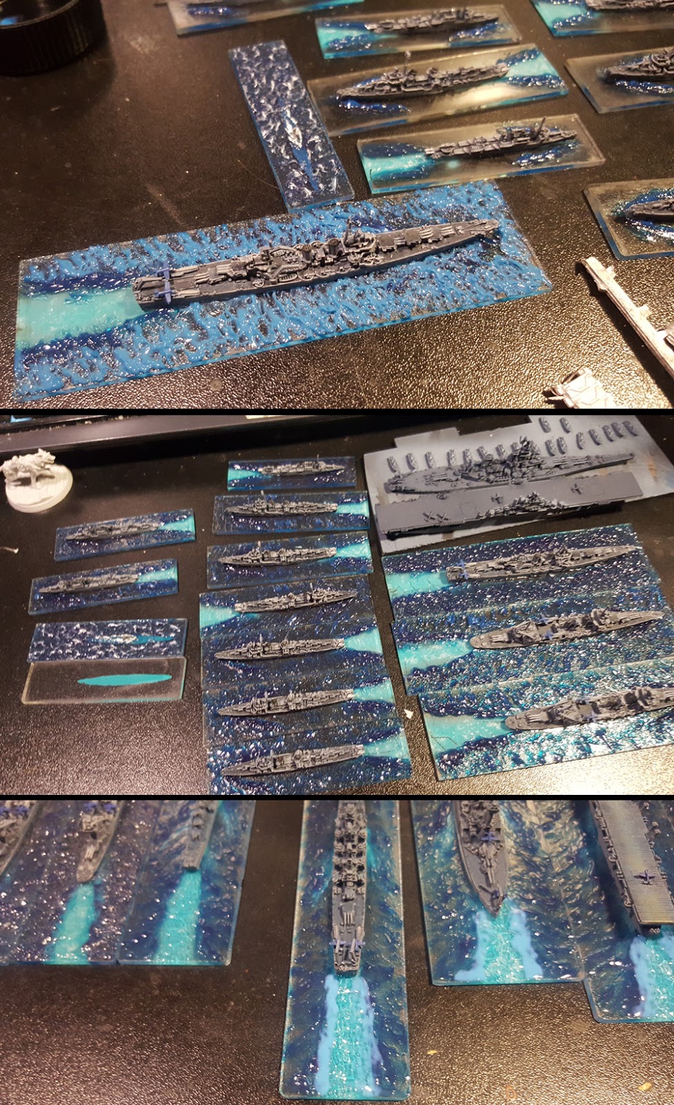
Step 5: You can see here the look of the chop when it dries. At this stage, I added the teal liquid in the aft chop. In thinner coats, it doesn't hold a lot of colour, but does add some refraction to light passing through, helping add depth to the chop underneath.
Step 6: To fade the colours, I applied a very watered down layer of the darker blue to the edges of chop, and add more depth to the under-teal paint so it would look like water disturbed and filled with billions of bubbles.
Step 7 (not shown) is to add stipples and trailings of white acrylic to the top of select waves, and to the bow wake, to represent the chop and foam.

