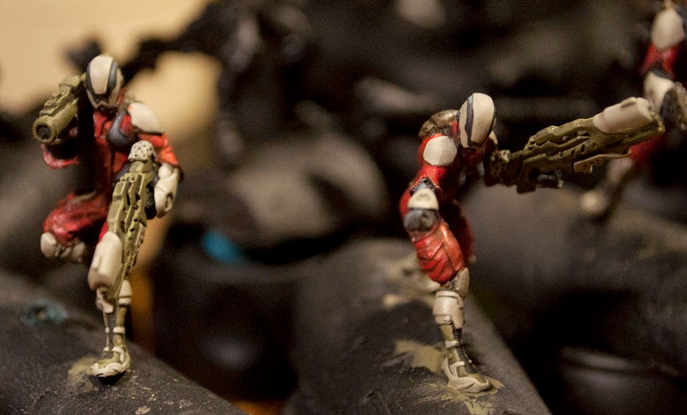
Well, it's been a while! I swear I've been painting and all, I just keep forgetting to post or to photograph!
This is a bit an older post, but I finally re-found the photos for this and have decided to put them online at long last:
This is my entry from Q2 into the Mayacast Contest, the ever-awesome Infinity Nomad Iguana TAG.
Starting out, I decided to go with a more Central-American theme with this TAG, having done Africa with the two Geckos. The TAG's pilot is named Yupanki, which is a famous warrior/military leader, and translates roughly to "With Honour". It's been painted to stay consistent with the Geckos in colour scheme, except for that ominous and I'm sure in no way relevant right hand paint!
You may also notice the TAG is converted! I wasn't a fan of the angry point, so I decided to shift the pose to be a broad-shape shooting stance. With the belt feed HMG, it looked more dramatic that way.
Here you can see a more top-to-bottom pose for the TAG. I have the same safety warnings across the guy as with the Geckos, and while I considered a bunch of integrated black and white striping, I felt the full red just felt more in keeping with how I've been painting my TAGs so far.
The tail, from behind: this tail was annoying to paint. It's a lot of segments, and I primarily airbrushed it. You can also see the warning labels on the ammo hopper, and in general my non-metallic-metal styled metallic painting. It keeps it shiny IRL, and still has a nice light-to-dark.
The markings on the side of the leg and the shoulder pads are, in Mayan and Aztec writings, essentially translated are "Death Lizard" (on the shoulderpad in this case) and "Storm Lord/Chief" - I figure this pilot, with the honour of fighting in a full Iguana, has quite a bit of ego to him!
The colours are personal artistic license, but as with the Geckos, I want to make my TAGs look as much as possible like they've been decorated by crews with a great love for machines, and a bit less a love of military regulation. No idea what I'll do for the Salamander once it gets resculpted!
Upcoming should be the Van Zant from the most recent contest, as well as (hopefully) some of the other wild things I've been working on. I'll also try to limit the amount of downtime between posts, and actually get my butt back in gear painting and not just assembling and buying!
As always, happy painting!
Showing posts with label Corregidor. Show all posts
Sunday, October 30, 2016
Iguana post more often, really I do!
Labels:
28mm,
Corregidor,
Corvus Belli,
Iguana,
Infinity,
Infinity: The Game,
Nomad,
Nomads
Sunday, January 18, 2015
Mini Madness Update
Well, work is kicking my butt, and that plus being sick has meant I haven't gotten a lot of time painting. That said, I have an open call to all helpful readers of this blog: I am trying to collect ideas for 'bomber art' for my Geckos. I want their shoulderpads decorated in a very non-military fashion.
For examples, I am so far looking at WWII bomber art, Terran Marines armour art, and anything along those lines. I don't just want it to be 'seductive woman' type things, though I'm not against it.
That said, I can show you what I have managed to get done since the sickness passed. (Yay for strep throat)
My Geckos now have pilot names! I figure much in the same way that planes have the pilot's name painted on the side, it'd be neat to do something similar with these models.
Sankuru is the name of one of the longest rivers in the Congo region, and "Mwene" is a name meaning "Prince" (at least as far as Wikipedia tells me) - I wanted to have my characters named in an African style, for reasons of Nomad fluff and making an army in at least one game that isn't 90% "white" soldiers. I figured the orbital elevator mentioned in the Nomad fluff that is supposed to have been in Africa would have caused a lot of issues with people from that area, and didn't want to pick the name of a person actually alive. (I first thought about picking famous resistance fighters or soldiers, but didn't want to get into politics with models!)
It was fun picking the typeface online (a 'face called Planet Kosmos btw) and then painting it carefully in so it'd fit with the lines.
My paint consistency was so low even my airbrush would have complained, but I had to make sure it wouldn't dry on the brush! I had lots of water standing by to soak the brush out as well afterwards.
Next up for them is cleaning up glowy bits, deciding where, if anywhere else I put the painted lines, and then adding caution and warning indicators (like all good military craft have).
Labels:
28mm,
Corregidor,
Corvus Belli,
Gecko,
Geckos,
Infinity,
Infinity: The Game,
Nomad,
Nomads
Saturday, November 15, 2014
Tomcats Coming Along
An updated paint post at long last!
I finally managed to get decent enough lighting to take pictures, and was advanced enough in my painting that I felt it was even worth taking pictures. Without more delay, behold the Badger Squad of the Tomcat regiment!
First up the Heavy Weapons guy, and the Engineer, getting close to finished...
...followed by the Doctor (and sneaking in the side, a Clockmaker).
I've painted the black parts of their armour now, and the red is washed to be as bright as I want it for them. Similarly, the pale armour is painted, with its usual limited brightness scheme (matte armour saves lives!) Since photographing I've managed to paint the 'gems', and will soon be doing final touch-ups, and symbols.
The helmet pattern was decided somewhat by accident; I didn't want the entire helmet to be drab, and when I painted the first stripe and noticed how the pattern went, I decided that the stylistic paint and black band would both help imply that they can see through their helmet, and break up the surfaces (justifying the three layers).
I'm really happy with how they've turned out so far, I'm just hoping I won't mess them up at a later stage...
As you can see here, the doctor's chest pad needs a bit more blending on the black to pull the layers together. I went with a brighter scheme for the Tomcats because unlike the other Corregidor units, these folks are first and foremost a rescue team. There's a reason most first responder outfits are bright and noticeable, and so that carries through to their uniforms. Their backpacks, belts, and pouches are still the utilitarian colour I'm using across the force, figuring like any military, they're going to save on material costs if they can, where they can.
Like the doctor, so the engineer: utilitarian garb, bright emergency fatigues, and some kind of strange device in her hand (presumably to analyze or repair) that I'll have to make look distinctive.
Here's the one Tomcat in the cluster that doesn't muck about with 'healing' or 'helping': This guy's all damage. Combi-rifle (the new version is so much more practical looking) and a portable missile launcher up and ready to go. He's going to be a nightmare to fix to his base, but he looks pretty damn cool.
No real update on the Zondcat that goes with them just yet, I've been focusing too much on the infantry to deal with the mass of red she requires.
Labels:
28mm,
Corregidor,
Infinity,
Infinity: The Game,
Tomcats
Monday, September 08, 2014
Wildcats, Hellcats, and Prowlers; Oh My!
I have finally gotten the first 'wave' of my Infinity painting done! Ten models ready to be matte coated and based as soon as I can get good weather and some spare time to do it. In the meanwhile, pictures for all!
I struggled for a while on how to do their symbols. The entire reason for this paintscheme is that it makes more sense for a military unit to be drab than bright red. That is contrasted by the fact that the Nomads primary colour is red. (Also known as the least camouflaging colour you can pick next to "dayglo"!)
I did a photoshop mockup of where I'd put the symbols in each case, and toyed with them until I found a setup I didn't dislike. First I'll show the easier ones to solve, then on to the harder choices.
The Prowler was one of the first models I painted (and one of the first I bought: Such an awesome pose.) He's the test-case for drab, and other than his pistol's grip, is remarkably subtle compared to some of the other schemes I've seen of him. The symbols for him seemed pretty straightforward; Nomad on the left shoulder, Bakunin on the right, so any enemy that spots him will see the "national" pride, whereas his allies will know where he came from.
Next up were the Hellcats. Being troops that scream in from a dropship on jets of antigrav (?), I was less concerned about 'stealth', which is why their shoulderpads have a nice distinctive Corregidor and Nomad icon. The back of their burners have squad identifiers (3-1, 3-2, 3-3) in case I ever have to distinguish them quickly stats-wise.
Ahh the Wildcats. After much debating, I decided to use that random circular patch on their right shoulder to be the Nomad symbol location, and put Corregidor's icon beside it. Their unit identifiers (4-1, 4-2, 4-3) were likewise done in low-vis beside it, with a kind of sci-fi font styling. Since I didn't want big obvious indicators on their leading shoulder, I decided to do an imitation QR code on each. I figure any Nomad helmet and HUD unit will know to read the codes to indicate "Nomad", and perhaps even name, rank, and branch of service. This way you don't lose your IFF even if you're hit with electric countermeasures (just hopefully your allies haven't been as well), and no enemies will be immediately able to identify.
I did struggle with this at first, because though they are line troopers, it's implied in the fluff they're often called upon to do shipboard combat. I figure in such situations, with cramped corridors, and a race against the clock and overwhelming odds, it's more important to whip around a corner and recognize an ally. Also, camouflage in an enemy ship would be difficult to guess ahead of time. Eventually I went more subtle because it kept the theme more consistent.
Also note the Wildcat's random disks at the front of the armour. Again, since Corregidor is often called upon to engage in zero-g or hostile spaceborn environments, having on-suit lamps that aren't attached to a gun or hand-held would be incredibly useful. I figure they're suit lamps (off when in daylight, of course) and perhaps that left-forearm device is as well.
Thus is my war against glowy armour on stealth units going strong! Since these photos I gave a dark, dark cyan wash to the helmet visors to make them richer, and to the gems to help settle the layers in.
Soon, pics of the Reverend Custodier, Zondbots, Intruder, Alguacile... I wonder if I'll have them all done by the time Icestorm shows up!
![]() |
| Pay no attention to the background... |
I did a photoshop mockup of where I'd put the symbols in each case, and toyed with them until I found a setup I didn't dislike. First I'll show the easier ones to solve, then on to the harder choices.
The Prowler was one of the first models I painted (and one of the first I bought: Such an awesome pose.) He's the test-case for drab, and other than his pistol's grip, is remarkably subtle compared to some of the other schemes I've seen of him. The symbols for him seemed pretty straightforward; Nomad on the left shoulder, Bakunin on the right, so any enemy that spots him will see the "national" pride, whereas his allies will know where he came from.
Next up were the Hellcats. Being troops that scream in from a dropship on jets of antigrav (?), I was less concerned about 'stealth', which is why their shoulderpads have a nice distinctive Corregidor and Nomad icon. The back of their burners have squad identifiers (3-1, 3-2, 3-3) in case I ever have to distinguish them quickly stats-wise.
Ahh the Wildcats. After much debating, I decided to use that random circular patch on their right shoulder to be the Nomad symbol location, and put Corregidor's icon beside it. Their unit identifiers (4-1, 4-2, 4-3) were likewise done in low-vis beside it, with a kind of sci-fi font styling. Since I didn't want big obvious indicators on their leading shoulder, I decided to do an imitation QR code on each. I figure any Nomad helmet and HUD unit will know to read the codes to indicate "Nomad", and perhaps even name, rank, and branch of service. This way you don't lose your IFF even if you're hit with electric countermeasures (just hopefully your allies haven't been as well), and no enemies will be immediately able to identify.
I did struggle with this at first, because though they are line troopers, it's implied in the fluff they're often called upon to do shipboard combat. I figure in such situations, with cramped corridors, and a race against the clock and overwhelming odds, it's more important to whip around a corner and recognize an ally. Also, camouflage in an enemy ship would be difficult to guess ahead of time. Eventually I went more subtle because it kept the theme more consistent.
Also note the Wildcat's random disks at the front of the armour. Again, since Corregidor is often called upon to engage in zero-g or hostile spaceborn environments, having on-suit lamps that aren't attached to a gun or hand-held would be incredibly useful. I figure they're suit lamps (off when in daylight, of course) and perhaps that left-forearm device is as well.
Thus is my war against glowy armour on stealth units going strong! Since these photos I gave a dark, dark cyan wash to the helmet visors to make them richer, and to the gems to help settle the layers in.
Soon, pics of the Reverend Custodier, Zondbots, Intruder, Alguacile... I wonder if I'll have them all done by the time Icestorm shows up!
Labels:
28mm,
Bakunin,
Corregidor,
Corvus Belli,
Hellcat,
Infinity,
Nomad,
Nomads,
Prowler,
Science-Fiction,
scifi,
Wildcat
Friday, March 21, 2014
Nomad Paint Options
As I have cleaned, assembled, and basecoated my Nomads, my mind turns of course to paintschemes. I like to have a good idea before I start putting paint to model of what I will end up with, otherwise I tend to get bogged down at the halfway point trying to decide what to do for a certain section. In this case, it's especially important with the model count being so few, and the look of the models being so clean.
Luckily, I managed to snag the last copy of the art book from my FLGS and have plumbed it for fun things (I am a sucker for art books). I scanned a few photos of models I know I have, and put 'em in Photoshop to colour. I have a tablet that doesn't see as much use as I wish it did, but for things like this it is ideal. I can test out schemes quickly, imitate paint effects, and not worry about having to soylent green any models after too many applications.
As a preamble: I love the Ghost in the Shell series. The look of the combat armour, suits, 'tanks', etc. I love that even with opticamo, they still have nice drab outfits, and am leaning towards a look like that.
With that, here's what I have been musing over:
First up is a variation on the default scheme of Corregidor. Most of my models are (and will be) from this ship, so having a good strong red scheme seemed like a good idea. While I understand the mentality of "it doesn't matter their armour colour: Adaptive camo will take effect", to me, there's no reason to strain your poor camo computer by making it red to start!
With that in mind, you can see the three-part scheme above. I've done default bright red for the really noisy big things that aren't hiding: Hellcats, TAGs, possibly remotes, etc. Next up are the "support models". Represented here by a Custodier, this class would include Daktari, engineers, and the like, and feature a nice distinct white scheme.
Finally the black on the far right, while technically a hellcat in miniature, is meant to represent the more stealthy soldiers: Intruders, Zeros, and the like. Black on grey sets them up nice and dark, with red influences to tie them together. The advantage of this scheme is it follows the classic colour design combo of red-black-white, the disadvantage is it is nowhere near camo-like or Ghost in the Shell.
Holding to the white theme; One of my first wonders was an all-white scheme with either orange or red as accent colours. On this one I've also added a digital camo pattern, which if I do, I may do as hexes instead of squares. Being consistently white gives this one the advantage of being arguably more in line with the Ghost in the Shell feel, while maintaining Nomad similarity and allowing me to distinguish Bakunin and Corregidor. I'm not entirely sold though on HOW white this one is. I tend to find pure white schemes tough to make look really slick. Any mar, any inconsistent thickness in the paint, and the effect is ruined.
I've also toyed with one borrowing from above, but replacing the default white with a more urban drab. I would still heavily theme the white in patches, especially on the support models, but any of the 'line troops' would have a nice pale colour, not specifically indicative of any one background, but neutral enough to make it hard to distinguish features. I keep the red belts and details, and above have the digicam and non digicam versions.
Finally, a more olive colour. This one appears a bit minty-green, but I'd play with that colour to make it nice and neutral, using Russian Uniform as the base. In this one, white is used sparingly (and again almost exclusively on support models), and the red is limited. The mild green influence would help them be complimentary.
Overall I'm leaning towards the last two, with digital camo only applied if, once the model is painted, it feels like it wouldn't be too busy.
Currently you'll notice all the helmets with a shiny black. This is because the 'eyeslit' arrangement is not good for binary vision. My first solution of course is to turn them into up-armoured plexi, but I may decide to do them in standard colour, and just claim that where you can't see an eye slit, it's really a complex polymer/fibre-optic cable grouping that gives a better range of view, still protecting the face and allowing for a HUD.
Now comes the part where I sit with the various schemes, seeing if one starts to intrigue me more. Then I do a test model, and if I like that, paint the rest of the force!
I can't recommend this method of scheming out colours enough though. You can set up one, then do the "adjustment layer> hue/saturation" to pull around and get wildly different colours you may not normally think to use, but once you see them on the model, look right.
Labels:
28mm,
Corregidor,
Corvus Belli,
Infinity,
Infinity: The Game,
Nomads,
sci-fi,
science fiction,
scifi
Wednesday, March 12, 2014
The Infinitely good, the bad, and the ugly...
That left me with no sci-fi (or sci-fa) tabletop game. Like many others, I'm sure, the next closest port of call was Infinity by Corvus Belli. If you haven't taken a look at it, I highly recommend you do. The first time I was introduced to it, the pitch was "squad-scale combat that's got great mechanics". Ever a sucker for more models, I wandered over to their website, and was frustrated to find it an utter chaos of javascript.
I am a graphic designer by training. I dislike javascript so much because while it can be a great tool for internet navigation, it can also be used to make clean website design and navigation an utter nightmare. Infinity's previous website was lousy with the latter. I also mostly get into games because of the look of the models. Your game could have the coolest mechanic ever, and if it has mediocre or uninteresting models, I'll look elsewhere. By contrast, I will endure awkward rules, so long as the models continue to be fantastic (see above...)
In a nutshell, Infinity's website was a mess, I couldn't find out what troops were 'standard' or which were characters, what a range looked like as a whole, and so I put them aside. More recently, with a lack of sci-fi games, I swung back around to take a second look. This time they'd updated the website so that looking at an entire range was a thing you can actually do now! As I flicked through, I found Nomad models really spoke to me. Sure they're bright red, but for the most part, their armour is practical, relatively logical, and even on women: properly covering.
Specifically, I loved this:
Those models are lean, mean, and I can even overlook the field of view issues. The poses are compelling, everything feels like it makes sense, etc.
Similarly, this model quite strongly attracted me, for the reasons above:
Dynamic pose, interesting weapon design, strong colour scheme, and a woman in actually pretty practical outfits! (No power-armoured corset or stiletto high heels.)
Something I started to notice with a lot of the line though; while some models are fantastic looking, and others are 'okay' (and all ranges have models people will think are 'okay'), Infinity suffers from some models I think are absolutely ridiculous or outright ugly, and I can't figure out how they got past prototyping.
First up is what I am going to call the "Jethro Tull Sniper" or, as some others have pointed out, "Elmer Fudd":
That, ladies and gentlemen, is a highly-experienced, efficient, sought-after sniper. That is also a pose no sniper in history has ever made. Try it yourself: Balance one heel on your knee, and suspend a (presumably) 12kg weapon off said knee, and picture firing at any significant distance with it.
I understand not every sniper has to be in full prone sniping position, but if you're going to have him shooting, at least make him look like he could!
Next up is one that needs some explaining first. The "Daktari" is the Nomad version of a combat medic. They're daring, unarmed, and equipped to help heal downed soldiers. They're known for swearing in Turkish and for being badasses when it comes to healing, just not killing.
Picture in your head a combat medic. Heck, picture a modern military, and the guy who officially runs around with the medical gear. Looks a lot like a standard soldier minus the rifle, maybe, and with perhaps a little cross somewhere to denote his or her status? Now take a look at this:
Look at that... I know Infinity has a pin-up line, but this isn't that. There is nothing "Combat" and barely anything "medic" in that image! Yes, I know there's an alternate version that looks much more so, but man...
Finally, in the game Infinity, some models can actively hack others. This can shut down their armour, or in some cases, even take over robots and have them working for you. In this world for all that they've been inspired by Ghost in the Shell I suspect, they still manipulate the digital interface like Minority Report; hand up and with a holographic screen. The thing is, that only looks great when you can see all the CGI screen stuff. When that's not there, say on a model without it, the result is this:
That's jazz hands, or a surprised cat. I know folks have gotten transparencies printed that have the screens on them, and kudos to Corvus Belli for making those available, but it's still not a great look.
Why the post ranting about all this? Well, as any weak-willed gamer knows, the lure of a new game (and new shiny models) is an almost impossible call to resist, and I now have a Corregidor starter set and reverend custodier. Soon you will see a couple posts as I play through possible colour schemes and get to work starting a new science fiction-y force, and I had to discuss this first. I love so many of the models produced for Infinity, but I don't think I've ever had a reaction like this where it's beyond "eh, not for me" and right into "why did they..."
As a final plug, do take a look at their site: The rules are free to try, and it has mechanics I am so happy to see in a game.
Labels:
28mm,
Corregidor,
Corvus Belli,
Daktari,
Infinity,
Infinity: The Game,
Interventor,
Nomads,
Reverend Custodier,
sci-fi,
science fiction,
scifi,
Spektr
Subscribe to:
Posts (Atom)