Tuesday, December 30, 2014

Geckos Nearly Done

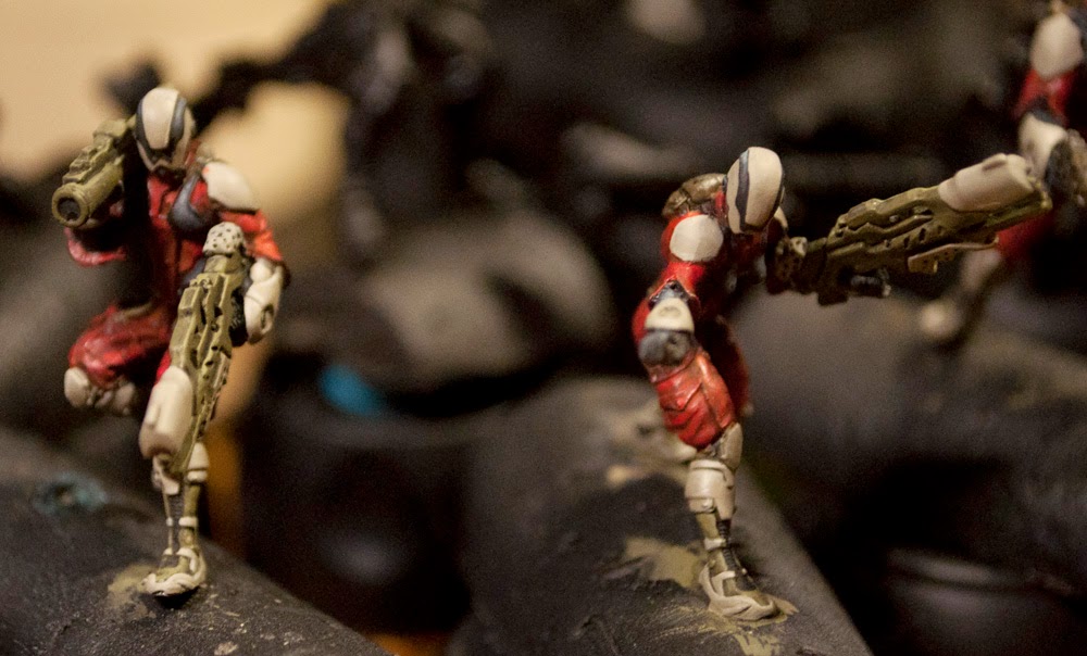
Well, despite the madness of the holidays, I've still managed to get some painting done! The Morats have been getting some armour painting, though I'm not certain how I'll paint the main plates. More importantly, I've made forward progress on the Geckos!

I love how, with no TAG arms, they look so stumpy!
First up is the main bodies. I've been carefully washing with agrax into the cracks, and even more carefully drybrushing white and edge highlighting to get the sharp redness.

Put 'em up... you wanna go?
It's been hard getting just the right amount of highlight. As much as his paintscheme is awesome, the main Infinity painter I feel does his models too pink, not enough red. To that end I've been trying to carefully only highlight with white, and if it goes too strong, I cover it in red and try again. I'm also trying to make the armour not look metallic red, which can be a challenge.

Now I need to determine where, if any, to depict white stripes and alternate colour plates. I may do the pilot's arm bands, torso, and chestplate in black, as well as certain elements of the helmet and legs in white. I also purchased a Gundam decal sheet so I can do a lot of appropriately accurate "Caution" warnings and arrows, since every real military vehicle has loads of those just in case. I'll have to consider where on the TAG warrants such a warning!

The metal bits are done in my favourite NMM-with-metallics method, going right from almost-black to mithril silver. I've decided to go a bit brighter than I normally would for military troops, because these are TAGs driven by pilots who know they're going to be spotted, might as well be flashy!

After I decide where all the proper military elements will go, I shall also be adding pilot art. (Think bomber art circa WWII.) I need to decide what style to do though: I can't just go scantily clad women for both! I'll likely pull inspiration from said bombers, and also any Starcraft Terran Marines I can find; they often have neat elements of the sort.

Wednesday, December 10, 2014

Not So Camouflaged Update

After great deliberation and much consideration, I stripped the paint from my Geckos and started again. As much as I liked the camouflage look on the infantry, for the TAGs it just didn't quite feel right. (Also, the paint came out fuzzy on the feet for some annoying reason, and that just can't be let go!)

Eventually what I figured was unlike the line infantry, who want to not be readily seen, the Geckos can't really hide, so instead they're trying to draw fire to help keep the nearby infantry safe. Also, in boarding actions, being a large terrifying blazing red behemoth could help when a poor defender hears the ominous thumping preceding its bursting around the corner, weapons blazing!

That said, images time!

So far they're entirely red. At some point I'll decide which plates (if any) will become other colours, and how to pattern them. These lads were airbrushed, with proper Vallejo Air paints, and I'm getting more used to using an airbrush for detailed work, not just coating or basic highlighting. I'm certainly nowhere near an expert yet, but I can at least come up with something competent looking!

Ah, the forest of bitz. Even more than the main body of the tag, these parts make me happy I'm going the red route. The bright shiny red shoulder pads alone make it worth the effort.

Next up is careful highlighting of edges, and determining if (and by how far) to highlight brighter than red. If you're not careful, the red starts looking either orange or pink.

I also have finished Tomcats photos, I'll probably do a post with them this Sunday.

Sunday, November 30, 2014

Experimentations

I swear I'm still painting, it's just so many things intervene!

With that said, Tomcat photos are on the way as soon as they get uploaded, but also, Yojimbo stuff!

I wanted to test out two-part mouldmaking, and had recently purchased the Yojimbo model. What better, then, than to cast his bike in hopes of burying LEDs in it and have the bike glow!

To that end, casting:


As so many have discovered before, Lego is truly the best mould-creation device. It allows you to lay out a shape in any size, and pre-stamp (and pre-channel, though I didn't this time around) to make it easier later.

The rubber mix I'm using is fantastic: It barely shrinks, doesn't bubble too heavily, and it looks like an awesome mutant blue gel while it's drying. I didn't vacuum-dry it, or anything, just vibrated it for a while to help move bubbles. This stuff is insanely viscous.

I was asked if I was concerned about it leaking through the Lego and all over the place, and I said not especially (see viscous, above). This shows how well the stuff penetrates though! Tightly sealed lego bricks still had a good 4-5mm of penetration!

And there's the bike cleanly removed. The second half of the mould looks a lot like the white part there, though oddly the two halves of latex fused, and I had to cut it back out. (Used mould release and everything!) I will have to figure out if there's any way I can modify that for my next go.

I then cut resin channels and air slits into the mould, and once I actually get spare time I'll try a test run. the second half did leave some minor bubbling and oddities, but I'm hopeful it'll work out.

Saturday, November 15, 2014

Tomcats Coming Along

An updated paint post at long last!

I finally managed to get decent enough lighting to take pictures, and was advanced enough in my painting that I felt it was even worth taking pictures. Without more delay, behold the Badger Squad of the Tomcat regiment!

First up the Heavy Weapons guy, and the Engineer, getting close to finished...

...followed by the Doctor (and sneaking in the side, a Clockmaker).

I've painted the black parts of their armour now, and the red is washed to be as bright as I want it for them. Similarly, the pale armour is painted, with its usual limited brightness scheme (matte armour saves lives!) Since photographing I've managed to paint the 'gems', and will soon be doing final touch-ups, and symbols.

The helmet pattern was decided somewhat by accident; I didn't want the entire helmet to be drab, and when I painted the first stripe and noticed how the pattern went, I decided that the stylistic paint and black band would both help imply that they can see through their helmet, and break up the surfaces (justifying the three layers).

I'm really happy with how they've turned out so far, I'm just hoping I won't mess them up at a later stage...

As you can see here, the doctor's chest pad needs a bit more blending on the black to pull the layers together. I went with a brighter scheme for the Tomcats because unlike the other Corregidor units, these folks are first and foremost a rescue team. There's a reason most first responder outfits are bright and noticeable, and so that carries through to their uniforms. Their backpacks, belts, and pouches are still the utilitarian colour I'm using across the force, figuring like any military, they're going to save on material costs if they can, where they can.

Like the doctor, so the engineer: utilitarian garb, bright emergency fatigues, and some kind of strange device in her hand (presumably to analyze or repair) that I'll have to make look distinctive.

Here's the one Tomcat in the cluster that doesn't muck about with 'healing' or 'helping': This guy's all damage. Combi-rifle (the new version is so much more practical looking) and a portable missile launcher up and ready to go. He's going to be a nightmare to fix to his base, but he looks pretty damn cool.

No real update on the Zondcat that goes with them just yet, I've been focusing too much on the infantry to deal with the mass of red she requires.

Sunday, November 09, 2014

On Customer Service

While I attempt to complete my Tomcats, contemplate paint schemes for Morats, and prep my Ghost in the Shell model team, I wanted to spend a non-photo post discussing something not often talked about in regards to model companies: Their way of dealing with customers who have issues.

While it's certainly not the most important element in a model company's business, (first being model quality, in my mind,) its a component which if handled well will inspire significant loyalty, and if mis-managed will be cause for hesitancy.

First a disclaimer: these are all based on first-hand accounts. If I've not mentioned a company it's because I've either not dealt with their customer service, or bought models from them at all!

The standard level of care, as far as I'm concerned, is exemplified by companies like Privateer Press, to whom you send an email describing a part that is missing or brutally mis-cast, and they send you a replacement part at a decent speed and it arrives swiftly. Corvus Belli seems to be the same, but I've not had first-hand experience. Many such companies request photographs or a packing code, so they can see what the issues are.

Next are the policies I feel are needlessly obtuse. Games Workshop asks you to go back to the store you purchased it at, replace the mis-cast or missing model with another one, and they will send the store a replacement model of that type. This must cause a lot of wasted product, and still presumably leaves the store owner with an unsellable, 'broken' model.

-Anecdotally, many fine-detail model companies have similar policies; one I heard tell of wanted a store owner to open another box of the same model, give them the missing/miscast part or sprue, and then they'd send a new box... it's unfortunately wasteful and still causes a lot of delay!

Sadly, the reason I've decided to write this post is Wyrd. Their models are very pretty, but if you get a mis-cast or missing piece, you need to navigate to a small and hard to find "contact us" button, send a request, and then wait. When you get a response, it says you can respond directly to the email, but that doesn't work. Text suggesting how you should format your request (and where to put related images) is small, hard to read, and not aligned properly.

In what I'm hoping is a unique experience, my request actually disappeared from their system without being filled! I'm happy I verified things were not as they should be, because people at the company didn't realize it hadn't been properly sorted out! I'm still waiting on an item that was mis-cast in June, and on two things related to an order from Gencon.

Now for the gold standard, absolute best I've ever dealt with:

Congratulations CS staff at Battlefront, you people are amazing. Battlefront, the makers of Flames of War, are a relatively small gaming company based in New Zealand, with models produced in Malaysia. Their factory staff are required to go through model building training, so they understand the pain of things like mould lines and miscast pieces, the better to catch them. Alongside that, an email saying something is missing is promptly responded to, and replacement parts arrive sometimes within 4 days (now, I do live in Toronto, so it's not hard to get something mailed to me!) Also, based on an interview done with WWPD, any issues not responded to within 24hrs (if I recall correctly) is flagged with a followup as to why it was not dealt with swiftly. This ensures a good turnaround time for models to people that want to do builds.

There's more though. The Battlefront CS staff are among the kindest people I know in regards to this. I don't want to go into detail as to why, because I would hate to see them taken advantage of, but on a few occasions, in regards to conversion projects I was planning or more nit-picky model issues, they have been equally quick with help. A friend and I were trying to find ways to send them gifts, but all the ones we would want to send we can't... I hope this post goes some way to assure them they're the best, and absolutely keep me happy buying Battlefront products!

I will try to have more model pics up soon, along with some of the planned, active, and eventual conversions!

Friday, October 24, 2014

(Near) Completion of a Monster

I have been gradually settling into my new schedule and working in times to paint around the various hours of work and wedding plannings. As such, soon Tomcats should be finished, and I'll work up the nerve to continue with my Geckos. In the meantime, I can show off something I've mostly finished, save some final basing elements.

Some time ago, when I was still playing GW, I wanted a Tyranid Prime that wouldn't just be another Tyranid warrior. Where to find something that was unique, and distinctly me? Where, indeed, to spend my next bout of nerd-model energy?

Why not Kerrigan?

Why not indeed?
I have finally managed to paint her to a point where I am okay with resting. As you can see in my previous posts detailing her conversion, she's a heavily modified Dark Eldar warrior, mixed with a Mordheim acolyte's head, Eldar biker arms, and one hell of a lot of greenstuff and modeling wire.

I kept her fairly bland in paint scheme. Since her various portrayals depict her anywhere from bland to brilliant in colour, I figured I'd pull what I liked from wherever.

To that end: Any bony plates are Burnt Umber highlighted up to Leather Brown (all Vallejo) mixed finally with Vallejo's equivalent to bleached bone (so well used that I have rubbed off its official name!)

The flesh is a rich dark purple, highlighted up through paler versions with the bone colour again. Her skin is actually almost the same mix I use on my Nomad armour, which emulates the pallid nasty flesh she has. The lips are a much more rich colour based off the flesh of her body. The base is a mix of Vallejo Violet, with successive layers of drybrush and wash to make it look like whatever died and fell has just mulched together to be the "Creep" from Starcraft Zerg fame.

The hair was the most fun/difficult part. getting the segmentation right involved careful highlighting of first each segment with the midtone, and then an almost drybrush pass on each segment end with the highlight colour. In a few cases I went back with the basecoat to re-add the fine dark line. The hair locks themselves aren't segmented, because they're too fine to make easily, and wouldn't look any better than painted as-is anyway.

And that's Kerrigan! Will she end up as a Tyranid prime? Sadly likely not. I've taken a GW hiatus for an unspecified time, but she will join the noble nerd-model ranks of Cthulhu, Ash, Hogan's Heroes, Indiana Jones, and Gordon Freeman, and will soon (I hope) be joined by Hot Fuzz's protagonists and Section 9 of Ghost in the Shell!

Tuesday, October 14, 2014

I am back! (Sort of)

Wow it's almost been a month...

Between a best friend's wedding and trying to plan my own, plus a work schedule that shifted to right in the middle of my usual painting hobby time, I've not had much chance to do anything!

Today though, a brief update of what's on my desk. Nothing especially finished yet, but I'm getting there:

(All photos from my cell phone for the time being)

My Intruder is essentially finished. I need to clean up belt buckles and belts, and spray-coat him (hopefully such that he doesn't go foggy like the last round did!)
It's kind of surprising how much of him ends up drab when your goal is to paint all the armour plates!

Likewise are the Alguacile hacker and Clockmaker close to finished. Clockmaker needs insignia and pouches, Alguacile needs final highlights on her straps and pouches. I had to convert the Clockmaker head; I just found the original to be too bizarre, and so gave him a helmet that looks a bit like a welder's mask.
(You can also see the troublesome Daktari in the background: I've been trying to figure out how I want to paint her hair for some time.)

Finally, the Tomcats are on the blocks! Using my current scheme 'rules', they are nearly entirely red! I should try to limit this, since I'm generally against glowing red soldiers, but I think I may keep it. They are, after all, primarily an emergency response team, and there's a reason firefighters aren't camouflaged!

The amount of detail on these figures is astounding. I've had to go almost instantly to fine detail brush to make sure I don't miss anything! I have to debate if I'm going to do the butterfly zondcat in the drab of the zondbots, or bright red, or a combination of the two.

More soon! (Hopefully not a month from now at least).

Monday, September 22, 2014

Let There Be Light!

I have been unable to post for a while: Between work and trainings for work, I haven't had a lot of painting time. That said, I have based the first batch of Nomads, and done a necessary repaint of certain parts thanks to a misbehaving matte varnish spray can... (Luckily, no significant damage was done.)

I also had the lamp previously shown broken break again. Debating between buying a new bulb for an eternally tricky lamp, and just buying a second LED snake lamp, I went for the latter. Turns out it was on sale as well!

(I know it's a bit blurry)
Behold! It's the "Studio 3B clip lamp". I found it at "Bed, Bath & Beyond" of all places, and this one cost $25. For it's price it's incredibly bright, has a daylight-tone colour, and its biggest advantage over my previous halogen bulb light: No heat. I can not tell you how many times I went to move it, or even just leaned over the wrong way, and nearly burned myself. This thing can be grabbed at any point and after any length of use without fear of burning. For me it's also about the size of my palm, so it's an easy grab to bend.

This one is what officially replaced the Halogen lamp. I managed to find this one when it was on sale for only $17.50, which made it an even clearer decision than when I first set out! With the two of these, I have almost entirely obliterated shadowing when I paint. The only disadvantage is it's a bit harder now to shadow-find mold-lines, but I'll take the improved usability over that any day!

I'm on track (I hope) to finish off the second wave of my Infinity stuff shortly, and will be seeing what I can do for my geckos shortly thereafter. They've had a bit of fuzzing from the airbrush, so if I can't clean them properly they may get a redo...

Monday, September 08, 2014

Wildcats, Hellcats, and Prowlers; Oh My!

I have finally gotten the first 'wave' of my Infinity painting done! Ten models ready to be matte coated and based as soon as I can get good weather and some spare time to do it. In the meanwhile, pictures for all!

Pay no attention to the background...
I struggled for a while on how to do their symbols. The entire reason for this paintscheme is that it makes more sense for a military unit to be drab than bright red. That is contrasted by the fact that the Nomads primary colour is red. (Also known as the least camouflaging colour you can pick next to "dayglo"!)

I did a photoshop mockup of where I'd put the symbols in each case, and toyed with them until I found a setup I didn't dislike. First I'll show the easier ones to solve, then on to the harder choices.


The Prowler was one of the first models I painted (and one of the first I bought: Such an awesome pose.) He's the test-case for drab, and other than his pistol's grip, is remarkably subtle compared to some of the other schemes I've seen of him. The symbols for him seemed pretty straightforward; Nomad on the left shoulder, Bakunin on the right, so any enemy that spots him will see the "national" pride, whereas his allies will know where he came from.

Next up were the Hellcats. Being troops that scream in from a dropship on jets of antigrav (?), I was less concerned about 'stealth', which is why their shoulderpads have a nice distinctive Corregidor and Nomad icon. The back of their burners have squad identifiers (3-1, 3-2, 3-3) in case I ever have to distinguish them quickly stats-wise.

Ahh the Wildcats. After much debating, I decided to use that random circular patch on their right shoulder to be the Nomad symbol location, and put Corregidor's icon beside it. Their unit identifiers (4-1, 4-2, 4-3) were likewise done in low-vis beside it, with a kind of sci-fi font styling. Since I didn't want big obvious indicators on their leading shoulder, I decided to do an imitation QR code on each. I figure any Nomad helmet and HUD unit will know to read the codes to indicate "Nomad", and perhaps even name, rank, and branch of service. This way you don't lose your IFF even if you're hit with electric countermeasures (just hopefully your allies haven't been as well), and no enemies will be immediately able to identify.

I did struggle with this at first, because though they are line troopers, it's implied in the fluff they're often called upon to do shipboard combat. I figure in such situations, with cramped corridors, and a race against the clock and overwhelming odds, it's more important to whip around a corner and recognize an ally. Also, camouflage in an enemy ship would be difficult to guess ahead of time. Eventually I went more subtle because it kept the theme more consistent.

Also note the Wildcat's random disks at the front of the armour. Again, since Corregidor is often called upon to engage in zero-g or hostile spaceborn environments, having on-suit lamps that aren't attached to a gun or hand-held would be incredibly useful. I figure they're suit lamps (off when in daylight, of course) and perhaps that left-forearm device is as well.

Thus is my war against glowy armour on stealth units going strong! Since these photos I gave a dark, dark cyan wash to the helmet visors to make them richer, and to the gems to help settle the layers in.

Soon, pics of the Reverend Custodier, Zondbots, Intruder, Alguacile... I wonder if I'll have them all done by the time Icestorm shows up!

Thursday, August 28, 2014

Kfz. 222 Panzerspah Patrol

As painting on my Infinity models continues when I have the time, I have decided to show off in greater detail models I'd previously finished.

The Plastic Soldier Company is doing a monthly painting competition, and I decided to submit a patrol of DAK cars.

Based off the Zvezda 222, the three have been extensively converted, with the central vehicle a conversion to a 223. (I have used so many paperclips in my time...)

Almost all the stowage on the vehicles is my own conversion. The Jerry cans on the 223 are plasticard; all wound by modeling wire as a tow cable; extra Jerry cans strewn about along with puttied tarps and rolls; a tinfoil Nazi flag; and a customized (plasticard) MG turret on the 223.

The rifle on the 223 is from a spare that came with another PSC kit, as is the spare tire (you have to look closely to see it doesn't quite fit the vehicle, being made for a Hanomag Kfz. 251).


The entire patrol was done up with the DAK typical sand colour, and had grey sponged on  to look like the sand colour being rubbed away. The vehicles often showed up in the desert the typical German grey, only to be hastily covered with any sand-coloured paint the troops could find. Since it was applied in bad conditions, any use, bumping, or rubbing would cause the paint to flake off, so high edges and common crew handholds would go back to being the basic grey. It's a uniquely German thing, and helps to make their vehicles stand out from the others.

Soon, more Infinity, I promise. I've done some work, not really finishing off anyone, and just need to photograph them. Here's hoping the 222s win!

Friday, August 22, 2014

Contest Entries: Diorama

My final piece for the Wyrd contest was a diorama depicting Santana calmly fighting off a Flesh Construct. I bought the one with the hapless victim about to be flung:

Originally, I thought about making the base incredibly fancy, but realized that would just detract from the models themselves. I used a subdued paint scheme to ensure that the few elements that should pop would do so (the blood, the bile behind the flesh construct, etc.)

For Santana, I experimented with using a more illustrative/painterly style, especially visible on her stomach. I was tempted to source light the entire thing, but with the Wyrd requirement (or so I thought) of a white background, the source lighting wouldn't have really worked.

The Flesh Construct (and zombie) was fun to paint: A lot of grey was mixed into his flesh tones, and I used a colder brown than I typically basecoat flesh with. This resulted in a very pallid, 'off' seeming skintone that was strongly contrasted by Santana's warm olive tones. The brass fixtures were done to feel especially steampunk, and to tie together with the eerie fleshtone. His victim was painted very simply, meant to look like just an average dockworker.

Since Santana has such a solid, no-nonsense pose, I decided to imitate that in her painting. The dusty brown trousers and jacket, the functional white t-shirt, and even her guild-approved reds are faded and dulled. This is no flashy gunslinger, this is a woman who gets things done brutally and efficiently. (Even her garb is functional.)

The base was done in my typical Malifaux fashion: Grey stone, washed with various colours to infuse some variety, then re-drybrushed with grey to fade out the colours more. I added some moss and water effects to get across the grimy, dockside nature of this encounter.

Overall, I like the idea of this woman dwarfed by some necromantic nightmare, calmly dispatching one opponent and lining up on another. I have an idea for my next diorama too, so we'll see when Wyrd next decides to swing a contest our way!

Wednesday, August 13, 2014

Contest Entries: Single

Next up is a model I was toying around with a bunch, and this was finally the kick to get it finished: Izamu!

I did a bunch of research for this guy, attempting to make him as accurate as possible for a samurai. back banners are relatively accurate, the armour colour seems to be incredibly common, and I replaced his casual use fan with a Japanese war fan. His weapon is curious; it's a Chinese weapon (Dadao) in blade style, but a Japanese weapon (Nagamaki) in handle comparison. I ended up just going with a simple verdigrised gold/brass handle with leather wraps, a bright metal blade, and gold rings.

The fan is a curious one. Samurai were known to have the typical folding style fans, often metal-bladed and meant for when a weapon was not permitted. (A short club, hidden as an accessory!) That said, they were very unlikely to be brandished on the battlefield, especially not by a blood-crazed giant of a man (spirit?) like Izamu. I did what I figured would be his more logical choice, and gave him a General's war fan. The latter was used in battle to both mark characters of importance, and to direct troops in the chaos of combat. Izamu seems first of all like the General-sort, and also the kind who would want to command his troops in battle, even if they are just figments of his own broken psyche.

I also kept his warrior mask on, but rather than the full-face version given in the box, I cut it back so it more resembled the traditional variant. Samurai often wanted to look as fearsome as possible, and a certain division commander even enjoyed bright red armour and big horns off the top, which worked great until he was sniped.

All the metal on his armour is likewise verdigrised and tainted, which goes with the tattered look of his pants, and the plethora of arrows sticking out of him. Unlike most of my Malifaux models which live in a world of bricks, cobblestones, and mouldering docks, Izamu lives in a world where he's still on a feudal Japanese battlefield, and I wanted to represent this with the bright green grass, flower bushes, and of course, a half dozen other arrows on the ground around him. This last bit was to hopefully explain he doesn't just suck at deflecting arrows, he's weathered a full barrage!

Most annoyingly, I discovered as I painted him: I suspect when making the CAD file for this, the designer mirrored the legs to make the pose. His clan symbol 'twists' two different directions depending on the leg! I had confirmed this to be the case too late in the project to cut and putty, so I just reflected the paint on the back banners in the same way, so they twirl different directions depending which side of the banner you look from.

I am honing my NMM-style metallic painting, and am particularly happy with the way his blade turned out. I'll have to start infusing colours, and see how that fares next!

Wednesday, August 06, 2014

Contest Entries: Crew

Well, the Wyrd contest winners are now revealed, and alas I was not included. That said, it was fun to try to paint a bunch of stuff in one month, just to push myself. I don't know if I will push thus again, but still...

That said, to start off with, my Viktorias Crew!


One image, as posted, and I'll go through them in detail below:

The Viks themselves, as before, are meant to look relatively utilitarian. They're well-off mercenaries sure, but they're not exactly rolling in it. As a result, their armour isn't entirely clean and polished, the clothing is relatively drab in colour (except Vik of Blood's red pants and black leather jacket), and the swords have a nice nod back to my first iteration of purple. I am still a little frustrated that the woman with arms in opposite directions has a level-chest, and the one with arms mostly leaving at the same level seems to have an anti-gravity boob, but that's something to discuss with the sculptor, and not really an issue in painting.

I love the new Taelor: I'll do a direct comparison soon, but man, more awesome pose, more practical clothing, a relic hammer that looks bizarrely old, the new clockwork arm is fantastic... My only issue was the ponytail going over her head. There is no way her pose makes her hair do that, so I put it in the more logical location of flowing down.

I gave Taelor and the Student of Conflict almost an identical paintscheme. I liked the idea of the Student latching on to this powerful potent figure, and that while Taelor may be all kinds of condescending to the various mercenaries and ne'er-do-wells in Malifaux, this child with a brave heart would speak to her. The garb for the Student is very utilitarian, and so I matched that paint-wise with a rough-and-ready wool fabric, boring scabbard, etc.

Also, hard to see in the pic is Taelor's boots are visibly steel-toed. There's a few scuff-marks where the metal shows through. I don't especially like the boot design for her or Vik Ashes; there's a weird run of fabric and belt buckles that sent me back to the illustrations just to find out what was going on.

Finally the Ronin. I figured rather than in any way attempting to make them look subdued, I'd do quite the opposite and make them stand waay out. I remember a fluff-tale for the Viks involving them eschewing armour for speed, and I figure they've passed this on to their disciples. I also wanted to theme each of them with tertiaries, since in the crew they kind of are. Viks are the primaries, Taelor's the secondary, and then there's the Ronin.

I ended up making the Cyan ronin almost look like Wendy (the mascot) and she is paler than I usually do skin, with vibrant teal/cyan clothes. the back-armour has the kanji for "ronin" on it (I hope), and bright red hair, which I'll probably do a tutorial at some point for.

Purple was made with a mind to using colours I rarely do: gray, and muted purple. I know it doesn't look as muted in the photograph, but it is. In keeping with the tertiary concept, it's a blue-purple colour.

Finally comes my Latina Ronin (I know, anachronistic or what?) I intentionally shaded her skin darker, and attempted to imitate a bright, strong, Spanish-style colour mix. The colour fade on the sleeves and stockings match, but I kept it simpler for the kimono and sash, to help them stand out more. At first I was tempted to go complimentary as a detail colour, but realized I should just go black. The yellow-orange and orange-red was so strong that to just go with the opposing colour would have looked off.

I kept the bases mundane, with cobblestones and water effects, figuring this is a crew that does not spend its time in the finer areas of Malifaux.

And now, with this wall of text for all, I shall see you next time! I may edit and upload singles-pics to intersperse in this post, after I've uploaded all three entries. Then, another post about Infinity stuff! I am now counting off days until we get to enjoy the Icestorm starter set!

Thursday, July 31, 2014

Filler Post Title

Wow this month has been busy. Wyrd's painting contest has eaten up all of my active time, and with it done almost two weeks ago, and judging finally closed, I'll be posting my entries. I am fairly certain I did not win on two, based on voting as I saw it, but I'm still hopeful for one!

Either way, it was a fun painting challenge, and I've used the surge of painting momentum built up from that to make a leap forward in getting my Hellcats and Zondbots armour done!

Good timing too, with Infinity's Icestorm a month away from full release. I've already pre-ordered a copy and am eager to get my hands on it.

I apologize for the lack of updates. At first I figured I'd spend the month doing some broader model-related topics, but I started getting to the point where any moment I wasn't working or keeping myself alive, I was painting. Posts soon! (Possibly even tonight.)

Tuesday, June 24, 2014

Wildcats Armour

It seems the world is conspiring against me finishing my Infinity force.

I finish Pandora, lay out all the Nomad stuff to be painted, and both Wyrd and PSC announce painting contests! Expect a few non-model updates over the next bit, and delay between true model updates. Wyrd is asking us not to show any work until it's finished, so I won't be able to document what I'm painting for the next bit.

That said, Wildcats!

I debated using a more stand-out scheme, before deciding I liked the Prowler one enough to try just them for almost all the units in my force. The first mix on the armour is a mix of "Japanese Tank Crew" (Vallejo 70328) and Leather Brown (70871) at about 50/50, gradually highlighted with the ever useful pale sand. I wanted to do a more muted overall look, making it appear like some kind of advanced ceramic compound. I also had a rule for myself of limiting (or eliminating) all the glowing elements, because that Penny Arcade comic is right!

At first, the armour is a very muted brown, just the straight mix. For these ones I was so thankful for my wet palette letting me do thin gradual highlights of colour. The legs are about half-finished and will likely stay that way until I decide exactly how bright I want to make the red.

After a few layers, you will start to know if you were exactly even with the mix, or had more green or brown. I took some creative liberties on which sections of the boots would have armour plates; I know the default scheme has a few reds, but I figured that any place not covered by the red 'pliable flak armour' (as I am sure it is) would be harder ceramic compound shock plate.

At the same time, I was working on the others. I have all the potentially-covering pieces placed on a bit of model wire to allow me to get under. Infuriatingly, the Nuln Oil wash has a 50/50 chance of going milky, as you can see on his gun. I am going to have to start infusing the wash with Vallejo black to stabilize it...

You can also see on the shoulderpad how the pale sand is starting to show as the primary colour.

The super-thin layers eventually build up to a good slick armour, where I start focusing more on refining edges, and accentuating certain armour sections. This has the downside, though, of meaning the time per coat slows down as I delicately trace each line, and hit each highlight. Thinner coats are critical here!

Odd as it is, I love this pose. The hunched over look of this and the other male Wildcat gives a feel of attempting to sneak down a corridor before spotting the enemy. Sadly, it does make the female stand out somewhat. I think if I ever decide to run a Wildcat hacker, I'll just call her the one.

Originally, I had the arms to these two mixed up. I couldn't figure out why they didn't cleanly line up, but then looked more carefully at the box. This guy's pose is _almost_ shooting at a target in front of him (or is targeting someone ahead and a bit below).

Eventually, I will have the three fully highlighted in the armour, touched up on the pants and boots, and glowing only where a self-respecting soldier would be glowing! Just one single model, a crew, and a duel/diorama away!

Sunday, June 15, 2014

For the Love of Light

I am delayed in any updates in part because of work, but also because I'm trying to paint very carefully my first few Infinity soldiers.

I had a bit of a terrifying setback that luckily I noticed before it went critical: the clamp that holds one of my painting lights had split almost to the point of falling off the desk! It's an alligator-clip style hold, but the entire thing is plastic. The pressure of holding it up (a metal spring, connected to a metal lamp) had apparently caused it to fracture right at a critical spot!

Well, the lamp itself is still good, just the clamp that's off. I have a... thing about not throwing out anything that still 'works' until it's truly dead. That left only one option: I had to repair it!

Shockingly, superglue was not strong enough a bond to seal it without further cracking, so I ended up taking more... drastic measures:

With the lamp base thoroughly disintegrated, I had to find a new means of attaching it to my desk. (By the way; it figures the critical part is weak enough to break, but the central section was built tough enough it took great effort to pull it apart!)

I have a bunch of art bulldog clips, which while not quite as strong as the original grab, had the advantage of being present, metal, and similar enough to work.

Rubber bands help to keep it in place, and while it looks like it has an intimidating lean, it's actually strong enough to secure itself! (So far...)

With that done, shortly I hope to have an update of actual painting stuff!

Thursday, June 05, 2014

Pandora Crew, together at last

It seems Pandora is photo shy. It's really difficult to get a good one of her! Nevertheless, here she is in all her painted splendour:

Isn't she just so innocently adorable?
The photos mostly had to be amalgams, because either the focus would only be on half of her, or too bright, etc. She was a ton of fun to actually paint though. I got to use techniques I haven't in a while, and really pushed my skin painting.


I knew I had to fancy up her dress when I saw how much flat space was on it. I had to delicately cover up the wisp of smoke/miasma coming off the box, because I knew I wanted to keep its eerie glow even when the model was painted.

Kade's also been finished and photographed now. It's odd; there's a notch under his leg where the teddy is supposed to slot, but I prefered the idea of him having paid attention to it right up until something else caught his eye... something warm, and naive, and vulnerable...

He was also incredibly difficult to paint in a way I'd not experienced previously: With only really skin and diaper to paint, he paints up so fast you feel like you're missing something. I must've looked him over a few times just making sure of that.


Candy of course looks appropriately adorable now. It's amazing how large the bases seem for Candy and Kade, especially being the plain discs.

Aand finally, the entire original crew. I may yet do some painted details on the sorrows and poltergeist, but for the time being, I want to leave them pure creepy plastic. They were the real motivation for clear bases: I may eventually do a scenic base for them with lights buried in, casting a creepy glow up through their base.


And then, one final group-shot to leave you with; Pandora amidst her creations!

Teddy will join them as soon as I can figure out what to do about his eyes.

Saturday, May 31, 2014

Pandora and Teddy

At long last, Pandora's at a state I am willing to declare 'done'! There's still some minor tweaking, as there always is, but with her done, and Teddy almost done, my Pandora crew is almost complete and table-ready! Tonight I'll be basing them, I hope.


Her cape's purple is the same as Candy's dress and Teddy's belly, which helps tie the crew together a bit. Her boots got a plain leather. I'll have better pics of her when I get the chance to take them on a day with better lighting. After a bunch of back-and-forth, I went with a relatively basic metallic colour for her box of evils, figuring doing anything too ornate would pull attention from the rest of her.

I'm happy with how the wisps of power look coming out of her box. It was well worth covering with blu-tac!

Next up is the beast that is Teddy. His claws have earned their gloss black, and I've painted the patterns on the patches. I wanted to make them look like parts of kid's blankets, as though they were sewn in after being 'found' elsewhere. I still can't decide how to do the eyes though. Glowing green, red, and fiery orange are all possibilities, as well as just leaving them as dark black as I can make them.

Something else I'm debating is whether or not to gore up the teddy himself. On the one hand, it fits the style. On the other, I've never been much a fan of the heavy use of gore on models, and I want him to appear adorable if you take a quick glance, with increasing creepiness as you really take in the various elements of his enhanced form...

I'll probably sit with this for a while, and then perhaps add some gore if he makes a particularly noteworthy kill in-game.