As I get more into this game, something I've found frustrating is the random pile of tokens one has to have to represent their order pool. It can be tough remembering which tokens go where, which have been spent, and keeping them sorted from the plethora of other tokens one needs to play the game.
I started wondering if there was a way to do a single dial, which would show both the 10 orders by default a part of an order group, and the lieutenant order without needing to be three tall, or be particularly awkward.
After some trial and error with a 3cm diameter, very plain set of dials, I upscaled and got a bit fancier, and ended up with this:
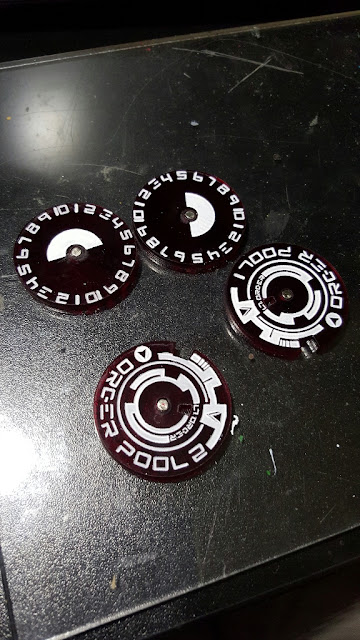
These are done with a very dark red translucent, and represented the first print out. With the time I had, and to make sure I could get as much as I wanted from them, I decided to run off a few more!
As you can see, they have "Order Pool 1" and "Order Pool 2" written on them. I figure if you're going much over two order pools, you're making a heck of a bizarre force or playing a very large game. The intent is to easily have all orders except irregular and impetuous (which are only ever model-based) represented in one easy location. Above you can see the pair of reds, plus a pair of purples, and two sets of black opaque. I'm mostly getting a feel for the different colour options, and whether translucent or opaque works better.
Here's a painted, magnetized, finished set:
These are the red ones, though on a black background of course they appear black. The over plate is meant to look like a hacking circle like you could see in Ghost in the Shell or Infinity, with a custom-made typeface, and subtle indicators of both LT order and regular order.
Here, thanks to a handy tissue, you can see the red showing through. The Lt Order is clear enough so that you can remember yourself if you used it or not. Since you have to announce its use and who on, I'm less concerned about having it super easy to read by an opponent, though it should be fine to read.
I think I need to modify the spacing of some of the numbers, to make the 10 and 1 not quite as close to one another (it results in a bit of LT Order overlap), and I may make the number window a bit wider. As it is though, I'm very happy with them and it brings a suitably sci-fi feel to the game board, and reduces token clutter!
Next, I need to design all the other tokens required for regular play...


