Saturday, May 31, 2014

Pandora and Teddy

At long last, Pandora's at a state I am willing to declare 'done'! There's still some minor tweaking, as there always is, but with her done, and Teddy almost done, my Pandora crew is almost complete and table-ready! Tonight I'll be basing them, I hope.


Her cape's purple is the same as Candy's dress and Teddy's belly, which helps tie the crew together a bit. Her boots got a plain leather. I'll have better pics of her when I get the chance to take them on a day with better lighting. After a bunch of back-and-forth, I went with a relatively basic metallic colour for her box of evils, figuring doing anything too ornate would pull attention from the rest of her.

I'm happy with how the wisps of power look coming out of her box. It was well worth covering with blu-tac!

Next up is the beast that is Teddy. His claws have earned their gloss black, and I've painted the patterns on the patches. I wanted to make them look like parts of kid's blankets, as though they were sewn in after being 'found' elsewhere. I still can't decide how to do the eyes though. Glowing green, red, and fiery orange are all possibilities, as well as just leaving them as dark black as I can make them.

Something else I'm debating is whether or not to gore up the teddy himself. On the one hand, it fits the style. On the other, I've never been much a fan of the heavy use of gore on models, and I want him to appear adorable if you take a quick glance, with increasing creepiness as you really take in the various elements of his enhanced form...

I'll probably sit with this for a while, and then perhaps add some gore if he makes a particularly noteworthy kill in-game.

Saturday, May 24, 2014

Update for May 2-4

Somehow, this weekend is not the holiday, despite being the 24th. That said it's time for a painting update! I've had a busy week and not had a lot of chance to paint, but I have gotten some things accomplished.

Pandora's skirt is fixed, and I had the weirdest thing I've ever seen. Somehow, mixing 50/50 dark angels green and snot green, and leaving it on the wet pallette for a few hours turns it into a colour-change, neon-green! Goes on subtle, ends up crazy bright!

As a result, I'll have to down-blend some of the squiggles, rather than highlighting them...

I also started painting the Teddy yesterday. My intent with him is to make him appear faded, for the most part, since they're turned into these horrible monstrosities from old kids' bears. The detail level is crisp enough that a drybrush works to bring out all the details. I'm going to go with ivory teeth and gloss black claws, with probably pale stitches and glowing eyes. The bow will be green to match with Candy's dress, of course!

Finally, I've narrowed a Nomad scheme down to the point of tweaking final elements. I know the colours aren't the best in this shot, but it's drab green gun, boots, and webbing, dark red pants, pale armour with white shoulderpads, and a bright cyan blue for data link and guide-lights on his backpack. I'll be adding more distinct elements of rank and delineation to his shoulderpads, and likely a bit more ID-type stuff to his helmet as well, before moving on to the Wildcats!

I am going to stick with my idea to have the more... aggressive units in this army depicted more brightly coloured. Hellcats and Tomcats will retain some of their aggressive colouring, as would be appropriate for people who launch into battle from above!

More to come once I manage to get some painting done!

Monday, May 19, 2014

Designs and Drawings

Well, I'm back from a laptop panic. My macbook is from 2007 and is being quite temperamental. I had to play around in Unix to make it behave again, so I've not finished as much since then as I'd like to have.

First up, the deck! I have decided to custom-create the designs for the royals, which may take me a while. I am going to have to consider what each of the suits would mean in a Malifaux context, but also in such a way as won't too directly reference the 'evil' side of Crows and Masks. If I can't find a design that works, I may stick to the defaults. I'm also likely to replace "Jacks" with "Mages", at least visually. Malifaux is a world populated enough by magic that I figure any deck of playing cards would reference them (the icon will remain the same of course.)

That said, here's the full deck laid out (still the old royals) with likely the background pattern I'll end up using:


But wait, there's more! I've been working on fancying up Pandora's dress, and I am frustrated by the skirt join. I have done everything I can think of to obscure the join line, and it still shows. I may have to do something scandalous and put epoxy putty on even though it's already been basecoated!

Here she is. I've tried to capture a better shot of her face that shows off the makeup. You can see my translucent skin effect on the legs, and the swirled designs on her skirt. They'll be further highlighted as I go along.

With computer problems sorted out for the most part, I should have more time now for painting, and can hopefully figure out what to do about that annoying fabric join...

Wednesday, May 14, 2014

Pandora Progress Update

I have at long last managed to finish off Candy, and along with have made progress on Kade and Pandora herself. Just today, before the rain set in, I managed to get the Teddy sprayed, so I will hopefully be able to get the entire crew done in the next week or so! (After that, I think I'll go back to Flames of War for a bit: try to get my LRDG and SAS crews finished up.)

Without further ado, progress on Pandora!

You can see the green line no her skirt where, despite my previous attempts to fill the gap, it remained anyway. Luckily, a little more liquid green stuff after I saw the gap, and it should be fine now.

Her hair was also causing me problems: I have a red that for some reason refuses to go as bright as in the bottle when actually applied (Vallejo flat red), but the Bloodletter red glaze from GW really brings the colour up to a good pure red! (Plus, adds that fresh glossy well-washed look!) I would normally make the 'red' a more natural redhead colour, but as with her skin tone, I wanted Pandora's appearance to be slightly unnatural, and so I went with a good strong red.

I also have managed to finish off Kade. The only thing not painted in this photograph is his hair, which was applied afterwards. Oddly, Kade went really quickly painting-wise, since he's essentially just three colours: Skin, diaper, and blade. (And eyes, I guess, so four...)

The skin here is also meant to be slightly eerie, but much paler still than Candy. It makes the colour scale lighter as the Woes appear older.

I like the new look for Kade, even if he is slightly oversized. He's more baby-like, sitting on his butt rather than stalking forward with his teddy bear. His overall countenance also seems more baby-like: Less manic glee over killing, and more brooding in a way, eerily enough, I've seen too many infants do.. >.>

And finally, Candy herself, finished until I inevitably find something I missed:

I must say I love this model. The slightly in-turned feet, the two-handed cutesy hold on the basket, the placid, slightly pouted face, the elaborate hair.. She's also a ton of fun to paint. Previously I posted the dress that inspired her lace, and now she has her hair settled. I picked Purple ribbons for her hair for contrast with the strawberry blonde, itself achieved by layering up from Leather Brown with a light wash of red at about the halfway point. I will likely keep her eyes blank white, as with Kade.

 I was looking up possible Victorian dress colour schemes and came across an odd one that mixed green and purple. With the subtle red of her hair, and green being a predominant colour in any Pandora crew, I had to try it for her waistline ribbon. White would have mixed with the lace, yellow would have been too straightforward, and the acid-strength of the green adds a kind of eerie quality to her outfit in general.

Next, I'm working on Pandora's dress. It has three distinct layers which I want to bring out more strongly than is currently represented on her illustration. I'll do a dark, slinky black-to-green for her slip, translucent where her legs push against the fabric, followed by the midtone green of her dress, and topped by (possibly faded) black for her cape. All of this will hopefully have little bizarre designs and swirls in the highlighting, unless when I try it, it looks bad. More soon!

Sunday, May 11, 2014

Infinite Joy

Time for an update on Infinity, as I finish up some other things.

First, the Geckos have finally been released! I bought some the instant they were in our FLGS (I got the last box of the first order!) and am drooling over the pieces, biding my time until I can get a colour scheme I am settled on.

I love the Geckos. They are truly the reason I got into Infinity, and the model quality is as good as their pics look. Legs slot comfortably into lower torsos, limbs are joined at logical points so if you want to do a conversion, it's not impossible, and the detail is incredible. Here are pics of the bitz, for those who, like me, find this kind of thing tantamount to porn:

(By the way; all the squares are centimeters.) Torso back and the backpacks. The alignment nubs socket well, and for the most part the backpack looks like it'll go on securely. I'll probably end up pinning it anyway, mostly because they'll be painted separately and then glued, so a pin will help secure the join.

Torso front and legs: The legs look blocky and powerful, which is what an exo-suit would need. You can see in places under the armour-plating the ferro-fibrous muscle bundles, and other than a few places where the flash is sizeable, the casting is fantastic. Everything sockets logically, and the shapes are slightly different, so you know which legs go with which torso.

The guns! I am a huge fan of the Mk. 12 pose, and I'm becoming more of a fan of the combi-rifle pose as well. These pieces are incredibly detailed and smoothly cast. There's again a few spots where the flashing is in bizarre locations, so be careful before you clip that you're not taking off detail!

"The Rest" - All the tiny bits and pieces that go into making the suit work. Stubby little person arms, back-toes, the heads, and the chain-colts (thank you Corvus Belli for making those separate pieces!) There's a lot of extra pewter in here. I have a bag sizeable enough I could start making my own models!

So, that's the Gecko. I also have been continuing to paint up my Nomad Prowler, trying to nail down his colour scheme:


I've nailed the overall armour colour, I think, and decided to go with deep red pants just for the sake of force unity. The white shoulderpads are also a nod to my final look. I still need to fine-tune their highlights (or more, the shade) and then add all the various military-like patches. The guns being olive drab I figure is a good way to convey that the guns themselves may get sold to mercenary groups, so a generic colour (and a neutral one) broadens the market. I may fool with that later, and especially with a gun the size of the Spitfire, give it more detail.

You can also (possibly) see on his stomach-plate, I tested the hex-armour idea. It does not work. The model overall is too small for the plates to come off looking right, and as a result they end up looking like some weird speckling. Once I've cleared the painting table a bit more, I'll get back around to finishing him up and determining if there's anything I want to adapt.

I still think I'm going to make the models that are more 'sneaky' the drab, and then more "aggressive" the red in increased amounts. No way a Hellcat is being stealthy, and a Gecko's not exactly going to hide behind a shrub! I will also, however, be limiting and essentially eliminating the 'glow' aspect of a lot of Infinity models. It's very sci-fi, I know, but it's also a bit silly to have a stealth suit that looks like a raver... Probably just wrist-comms and hacking gear that will end up getting a glow treatment.

Thursday, May 08, 2014

Let Me Show You What's In My Box...

I've started working on Pandora's crew a bunch. I love these models. The poses are so much stronger, the detail is fantastic, and in a lot of cases they've cleaned up the look of the models as well.

First up is Pandora herself. I wanted the skin-tone for her to be dusky, but also slightly creepy. I mixed my first brown layer with a bit of purple, and highlighted up from there, so she seems just slightly off in a way that's hard to put your finger on.

Then, I highlighted up to my proper skin tone, before giving her makeup. Green eyeshadow and lipstick adds to the unsettling quality of her skin and look. I'm debating how to do her clothes, though, so she ended up sitting for a while, with me debating tones, detail level, patterns...

Next I decided to work on Candy. Her skin treatment was similar, but I went far paler overall. With her dress I wanted to be not the goth black of her new look, nor the bright pink of before per se. My fiancee came up with the idea of a plum dress, which worked marvelously. I was also lucky enough to find an illustration of a dress that is almost exactly hers!

I wanted to do the white lacy frill around it, so first I painted that lower hem of her dress in grey (as with the wide collar) and then carefully painted an almost-white grey over top that, before accentuating the highlight sections:

Starting with just the basic pattern as you go around will let stuff dry, and allow you to touch up as needed.

(Sorry for photo blurriness) eventually I had a nice lacey pattern. I'll likely go back and really accentuate the lines once I know I'm done the rest, and am not worrying about stuff rubbing off.

The gloves were painted before I realized in her illustrations they're not supposed to be, but I prefer the look of her having nice cute white lace gloves. The wrist bangles will still be a good dark black though.

Also around this time the new Teddy came out, and I had to get one to accompany Kade. The new model is head and shoulders above the old one. Both in physical size and design. My one issue is something that is also 'wrong' with the Pandora spirits as well, and is an issue it seems with a lot of model makers. I'm tempted to call it the Miley Syndrome. Why does everything have to have tongues sticking out?! It's not terrifying, it's not even truly creepy, it's just goofy! On the Teddy, the old model's row of needle-fangs was just all danger. Whenever I see one with a giant snake of a tongue sticking out, I just picture them chomping accidentally on it!

That said, the new plastic would also provide much more (and much easier) conversion opportunity for those who want multiple Teddies; wholly separate head, head in two parts right along the jawline, and arms that are actually split at the shoulder combine to make this a model with great potential for modifcation.


My final photo for this version is the Teddy in dry-run assemble. I'll have to fill in a bunch of mold lines, and convert the mouth so his tongue is properly inside, but otherwise it's a sweet model.

Sunday, May 04, 2014

Viktorias Crew 1.0

It is time for more photos! I have now managed to upload the rest of the photos for the first Viktorias crew. I am not entirely happy with some of them, but I've worked them enough I don't think I can improve without a full scrap and redo.

First the ronin: I had to convert her hat to the one that comes in the accessory blister. The dinky little cowboy hat that she has is not a period piece, it's made I think exclusively recently. The rest, to fit her cowgal motif was border town, mud floor, and plain coloured clothing. I have done some fancying up of her swords, but I wanted to make her look relatively down on her luck. As with the Ten Thunders, I decided to have a single colour used on all models in the force, and in this case it's the bright purple of her sheaths. The blue ribbon makes an appearance in one or two other places, but that purple was the one I primarily wanted everyone to have.

Ronin 2 was also painted fairly plainly. I did a few embroidered roses on her coat (perhaps one for each of her kills to date) and limited the brighter elements to a shirt and of course, her swords. Her gloves and pants match, and her duster is basically just a browner variant of the same colour because again, I wanted them to seem rough and ready women, mostly wearing practical gear but with a splash of unique garb somewhere.

Note also the dock and pool of water she's standing on!

The final Ronin has the same sword painting style as the Viks themselves, and her clothes are equally mundane. Plain sturdy jacket, plain rugged pants, and with a light, possibly silken shirt. All three are mostly makeup-less as well, since one does not do fanciful makeup just to run out and smudge it in battle!

By the time I was working on metal-Taelor, plastic-Taelor was already revealed, and I knew she would be the one I'd use. I don't dislike the metal one, it just doesn't seem to fit her style quite as much. She's meant to be a crass, strong, dominant woman who's good in a fight. I can't imagine any such woman wearing a shirt like this unless that's all she had left/clean. What then to do with this model? Hmm, a figure that has had to sell the shirt off her back, but still cares about the weapons that are the tools of her trade? Sounds like a desperate mercenary candidate to me!

Durable denim jeans, covered with some kind of waterproofing chaps for mucking around a sewer, heavy durable boots, armour only on the side she doesn't have to aim with, and a detailed, if sturdy pepperbox pistol make the model. I used the hand from a discontinued Fantasy pikemen set, green-stuffed it to fit as a dueller's glove or a single nice thing she owns (also conveniently the purple thing for this model) and then tried to paint her skin and hair with a darker tone.

I do this on purpose to make this crew as varied as possible. The three metal ronin are fairly clearly one 'white', one 'black', one south-east Asian, so with this model I have a good variety of races represented. I also like the idea of the Viks being a pair that collect to themselves the mercenaries that would otherwise not get good paying jobs (if there's still issues with income equality today, imagine then!).

Speaking of, here's the ladies themselves. I've done the careful sword highlights, and otherwise the colour scheme is identical to the avatars. I love the poses of this pair, nicely mirroring one another like they were meant to be back-to-back.


Masamune's sheath is relatively plainly painted than I was tempted to do, but with its bling in intervals down the blade, trying to do any true detail would have been frustrating.

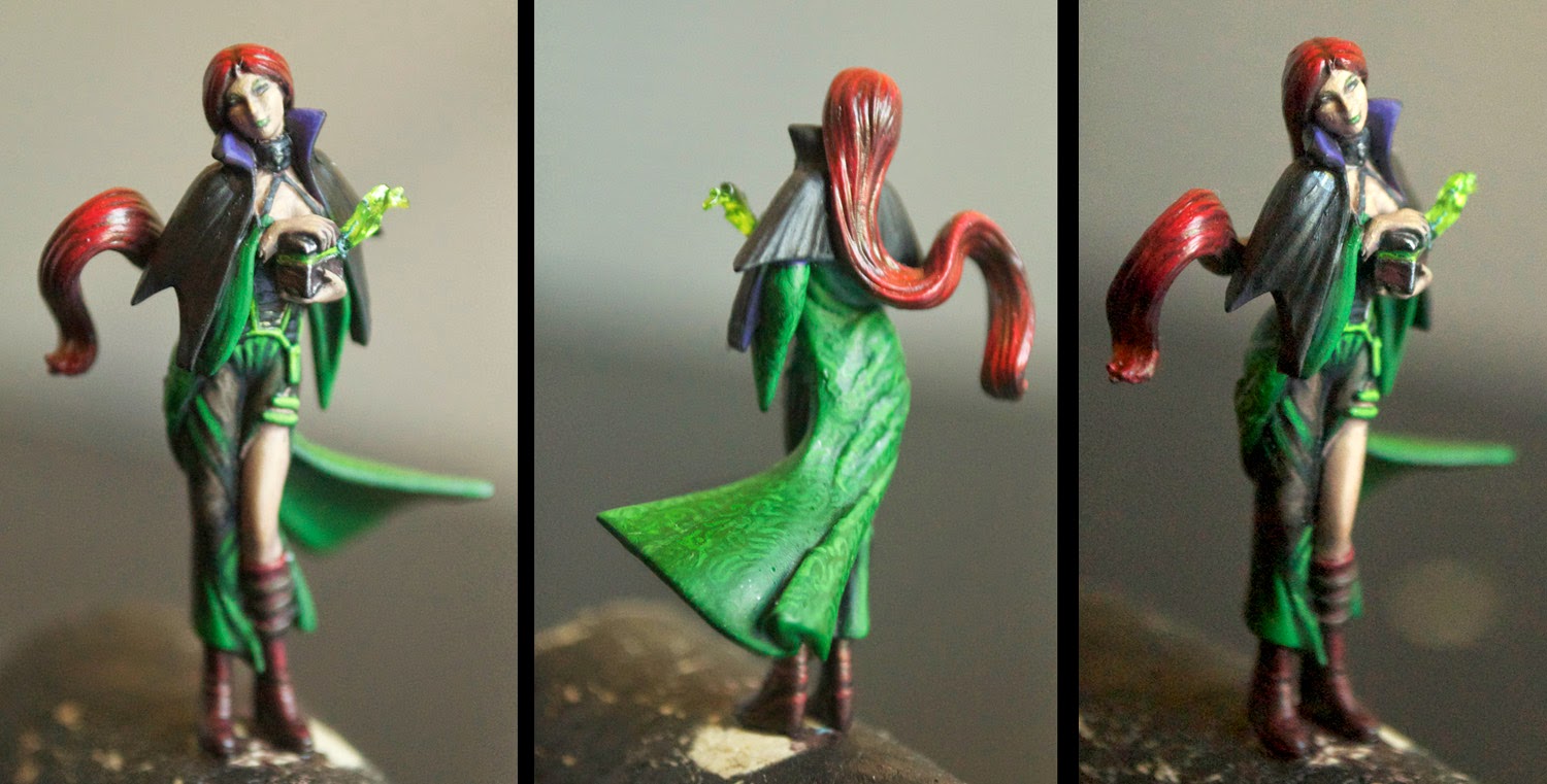
And finally, along with the Viks comes their sister, Vanessa! I know the box art has her dark-haired, but no way was I doing a black-haired sibling to two blondes! Other than that change, she too is 'rough and rugged' in painting, other than her bright glowing staff. If Wyrd keeps on the transparent model vein, I'd love to see her done with the staff at least done in clear plastic!